
More often than not, a restaurant’s website is the first thing a guest sees when deciding whether or not to book a table. It’s the new front door of your business and where people discover your restaurant’s atmosphere, the menu and ultimately, make a reservation.
Every part of a great restaurant website is an extension of your brand.
We’re showcasing 10 websites from our worldwide community of restaurants – the new generation of restaurants who nailed their website design and can inspire yours.
Location: Copenhagen, Denmark


Barr uses 1 large image on each page to capture attention and keep guests engaged with smaller photos as they scroll down the page. They’ve understood the importance of visuals and divided their header so it’s easy to find answers to questions.
Location: Stavanger, Norway


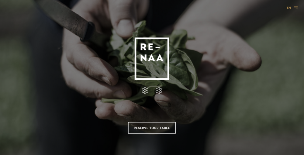
Re-Naa uses large images that highlight their connection to nature. The About page showcases Sven Erik Renaa before moving on to show off the restaurant’s Michelin stars. The reservation page, powered by Superb, is just as elegant as the rest of the website and matches the brand.
Location: Trondheim, Norway


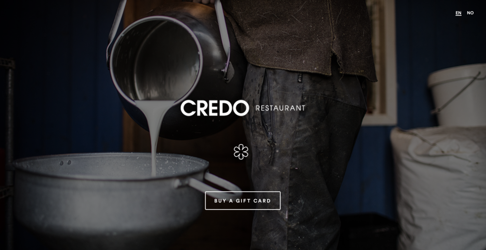
Credo’s website catches attention with “With love for raw produce” on the homepage. They’ve used a hamburger-style menu in the top right-hand corner to keep the page clean.
Because websites must be functional, they’ve added a pop-up in the bottom corner that tells you where to find the menu, gift cards and how to book a table. They’ve also built out the brand story even more with a blog section.
Location: Copenhagen, Denmark


Brace understands the importance of visuals. With gorgeous photographs and bold text, their website design encourages visitors to scroll down the page.
Clearly marked CTAs – like “Gift Card” – take away any guesswork and tell the guest exactly what action is suggested. They’ve also created a footer with important information and links to their social media.
Location: Copenhagen, Denmark


Sushi Anaba’s website is a lesson in simplicity. The overall clean design tells visitors exactly what vibe the restaurant has.
Notice that the menu is typed in the website, not added as a pdf. This makes it easy to see across all mobile devices.
The gift card feature is powered by Superb’s GXM platform and matches the brand in tone, colour and feel.
Location: London, UK

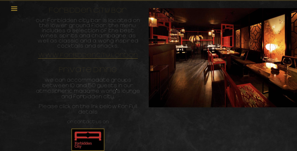
A. Wong uses a bold colour scheme on the website that fits perfectly with the actual restaurant. That same feeling is carried into the reservations page from Superb.
The website also showcases the option for private dining and the Forbidden City Bar – a great way to highlight different areas in your restaurant. For more on Andrew Wong and how he stays creative, check out the Experience Matters podcast episode here.
Location: Milan, Italy


Bentoteca has a colour scheme that continues throughout the site, putting guests in the right mood for the experience. The homepage presents the 2 options for languages – a great choice that keeps your guests from getting confused.
The homepage is also broken into sections, and the Reserve a Table does a great job at explaining what to expect and what’s needed. The Wine List is a nice touch and includes pricing, so guests know how to prepare.
Location: Oslo, Norway
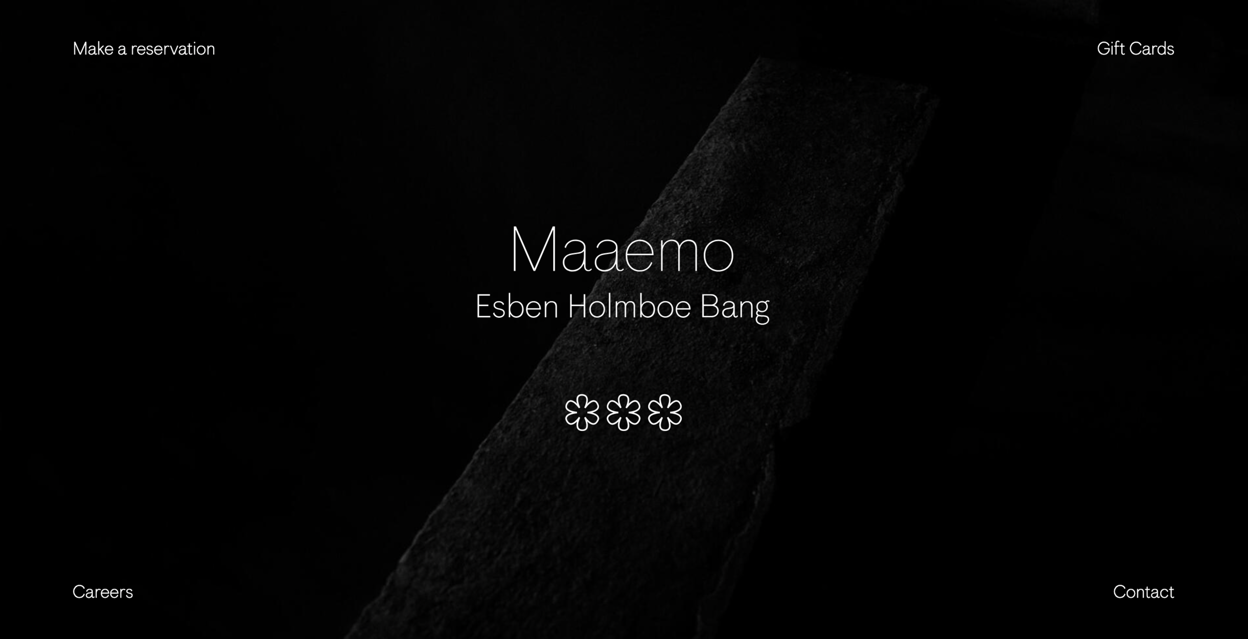


Maaemo’s website is the perfect example of minimalism. Notice that information is placed in 4 corners, not in the header or footer.
The whole website is super simple, clean and elegant. If you’re going to sell gift cards, take note of how well Maaemo explains the process to avoid confusion and extra work for the team.
Location: Venice, Italy


Venissa’s website is an elegant example of how the homepage can showcase everything from your food to your location.
Instead of a traditional About Us page, they highlight Chefs Chiara Pavan and Francesco Brutto under their philosophy. As a restaurant that focuses on experiences, they’ve described those under reservations, making it for guests to book in advance.
Location: Horjul, Slovenia


Grič uses beautiful visuals to grab attention from the homepage. With a detailed header and social media links in the bottom corner, visitors know exactly what to do on the page.
The site continues with information about upcoming events under News and even highlights the Duck Farm on the property – a great way to connect with guests and show more of their brand personality.


%20(1).webp)


.jpg)


-p-1600.jpg)


.jpg)


.png)


.jpg)
.jpg)
.jpg)

.jpg)


.png)
.jpg)

.jpeg)
.png)
.jpg)
.png)
.jpg)


.png)
.png)

.png)
.png)
.jpg)
.png)
.png)

.jpg)

.png)


.png)

.jpg)

.png)

.png)

.png)


.jpg)
.png)


.png)
.jpg)


.png)
.jpg)
.jpg)


.png)
.png)


.jpg)
.png)
.png)


.jpg)

